
Tired of spending hours styling buttons and forms from scratch? What if you could build a complete, professional-looking login component in under 10 minutes?
With Shadcn UI and Next.js 14, you can create consistent, accessible components that would typically take hours to build and style manually.
What you'll learn in this 8-minute read:
- Complete Shadcn UI setup (3 commands)
- Build a production-ready login form
- 6 button variants you can use immediately
- Pro tips for component consistency
Shadcn and Tailwind are a match made in heaven, so let’s get started.
What We're Building 🎯
By the end of this tutorial, you'll have a production-ready login component that looks like this:
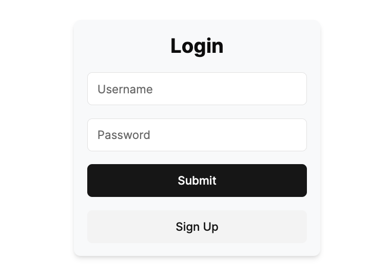 Professional login form - built in 10 minutes with zero custom CSS
Time Investment: 10 minutes | Skill Level: Beginner-friendly
Why Shadcn UI vs Other Solutions?
| Traditional CSS | Component Libraries | Shadcn UI |
|---|---|---|
| Hours of styling | Limited customization | Best of both worlds |
| Inconsistent design | Heavy bundle size | Copy & customize |
| Maintenance overhead | Vendor lock-in | Own your code |
Step 1: Create Your Next.js 14 Project (2 minutes)
npx create-next-app@latest app-name --tailwind
If you want to add typescript and EsLint you can add the additional flags
--typescript --eslint
Next we'll need to answer a few questions, you can follow as it is below:
Need to install the following packages:
[email protected]
Ok to proceed? (y) y
✔ Would you like to use `src/` directory? Yes
✔ Would you like to use App Router? (recommended) Yes
✔ Would you like to customize the default import alias (@/*)? No
After this completes we can now add Shadcn UI to our project.
Step 2: Add Shadcn UI to Your App (1 minute)
cd app-name
npx shadcn-ui@latest init
It will ask a few questions and you can follow as it is below:
Need to install the following packages:
[email protected]
Ok to proceed? (y) y
✔ Which style would you like to use? › Default
✔ Which color would you like to use as base color? › Neutral
✔ Would you like to use CSS variables for colors? yes
Once initialized you will see
Success! Project initialization completed. You may now add components.
and if you look in the folders you will see a components.json and you’re done with the setup!
Now let's start building our UI components.
Step 3: Install Your First Components (2 minutes)
By default, your project won't have any Shadcn UI components installed, we will add them as needed.
So for our Login component we’ll need a Button.
To import the button run this command:
npx shadcn-ui@latest add button
In your /src/components/ui you will now see the button.tsx
So let’s delete everything in /src/app/page.tsx and add the code below:
import { Button } from "@/components/ui/button"

export default function Home() {
  return (
    <div className="flex flex-col justify-center items-center gap-4">
      <h1>Home</h1>
      <Button variant={"default"}>Click me</Button>
      <Button variant={"destructive"}>Click me</Button>
      <Button variant={"ghost"}>Click me</Button>
      <Button variant={"link"}>Click me</Button>
      <Button variant={"outline"}>Click me</Button>
      <Button variant={"secondary"}>Click me</Button>
    </div>
  )
}
and let’s run our server
npm run dev
Then our page will look something like this.
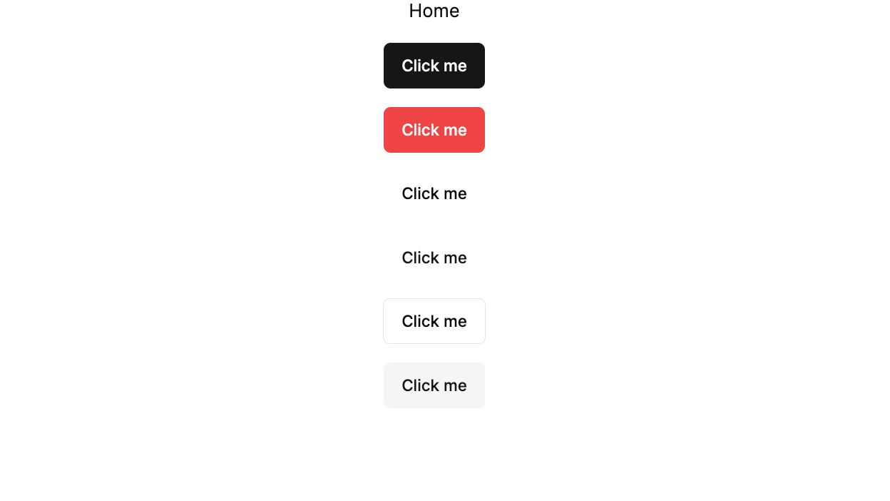
As you can see, we get 6 professional button styles using just the variant prop. This means:
- ✅ Zero custom CSS - No more writing button styles from scratch
- ✅ Perfect consistency - Same look across your entire app
- ✅ Accessibility built-in - Focus states, ARIA labels included
- ✅ Dark mode ready - Automatically adapts to theme changes
This single component just saved you 2+ hours of styling work!
We can actually do much more and if interested you can see the full line up in the Shadcn UI docs.
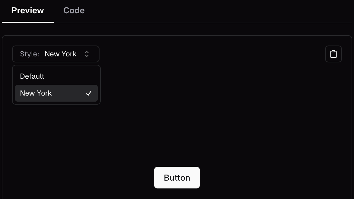
One thing to note is during the installation we had the option of going with Style as Default or New York using the docs we can see what that would have looked like for all the components.
Step 4: Build a Complete Login Component (5 minutes)
Okay next we’ll grab another component that will be the Input so in a new terminal you can run while our localhost is still running:
npx shadcn-ui@latest add input
Then in /src/app/page.tsx let’s update the code to:
import { Button } from "@/components/ui/button"
import { Input } from "@/components/ui/input"

export default function Home() {
  return (
    <div className="flex flex-col justify-center items-center min-h-screen">
      <div className="w-[300px] bg-gray-50 flex flex-col text-center p-4 rounded-lg shadow-md gap-4">
        <h1 className="font-bold text-2xl">Login</h1>
        <Input placeholder="Username" />
        <Input placeholder="Password" />
        <Button variant={"default"}>Submit</Button>
        <Button variant={"secondary"}>Sign Up</Button>
      </div>
    </div>
  )
}
With just a few lines of code we were quickly able to make a simple Login component using Shadcn UI.
🎉 Congratulations! You Built This in Under 10 Minutes
Compare what you just built vs. building it from scratch:
| Building from Scratch | With Shadcn UI |
|---|---|
| 2-3 hours of CSS writing | ✅ 5 minutes total |
| Cross-browser testing needed | ✅ Pre-tested components |
| Accessibility manually added | ✅ Built-in accessibility |
| Responsive design from scratch | ✅ Mobile-ready instantly |
Want to test it? Try changing variant={"default"} to variant={"outline"} and see the instant transformation!
Note to create a actual form Shadcn has documentations on how to create a proper Form component so make sure to check it out.
Common Mistakes to Avoid
- Don't skip the init step - It sets up your design system
- Don't modify components directly - Create variants instead
- Don't forget to configure your colors - This affects all components
What's Next? 🚀
Now that you've mastered the basics, go and build things with it!
Need a portfolio site? - Make it for Free at MyDevPage
Found this helpful? Share it with a fellow developer who's tired of writing custom CSS!
🚨 Do you need a Portfolio Website? 🚨
With MyDevPage you can build your own portfolio website in 1 minute. You need to focus on building great projects and enhancing your skills rather than wasting your time in building and designing a portfolio website from scratch.
MyDevPage handles everything:
- Update easily on the go from your phone
- Beautiful Portfolio Website
- Upload your resume easily
- Useful Website Analytics
- Simple Customization
- Add Custom Domain
- Control over SEO
- Contact Form
Try it out today (it's Free!) 👉 MyDevPage 👈